
Weeclap
An engineered identity for engineers who turn ambitious ideas into real products.
- Client
- Weeclap
- Sector
- Product engineering
- Year
- 2025
- Scope
- Brand strategyLogo & monogramBrand guidelinesIllustrationWebsiteStationery
The idea
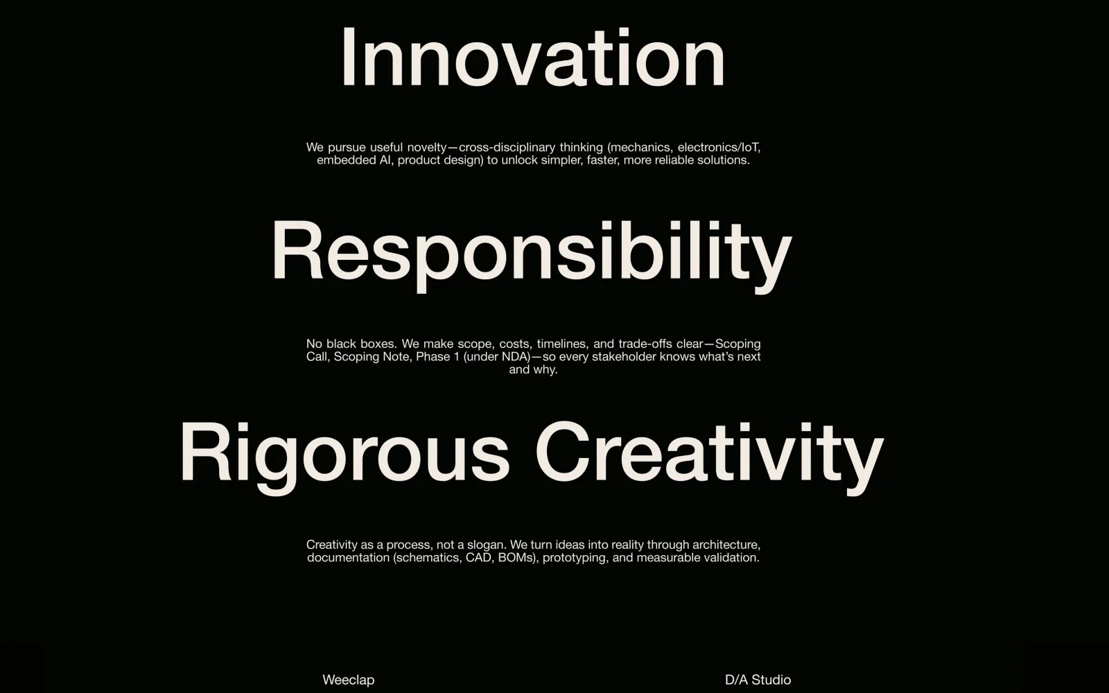
Industrial rigour, useful creativity.
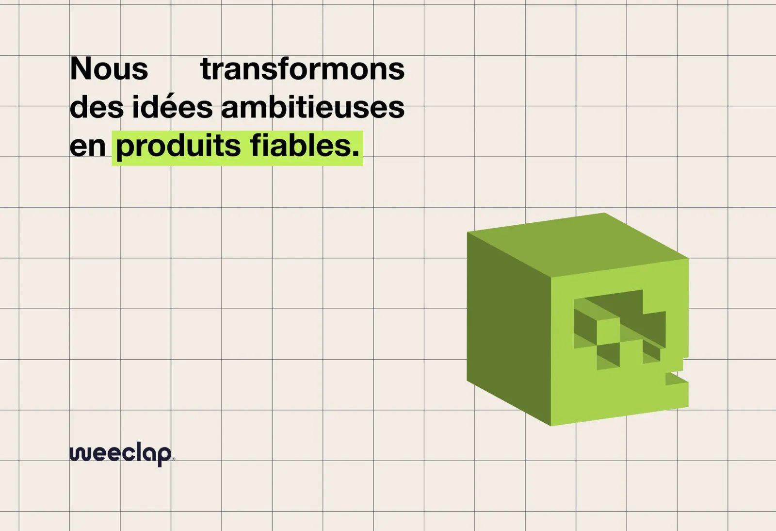
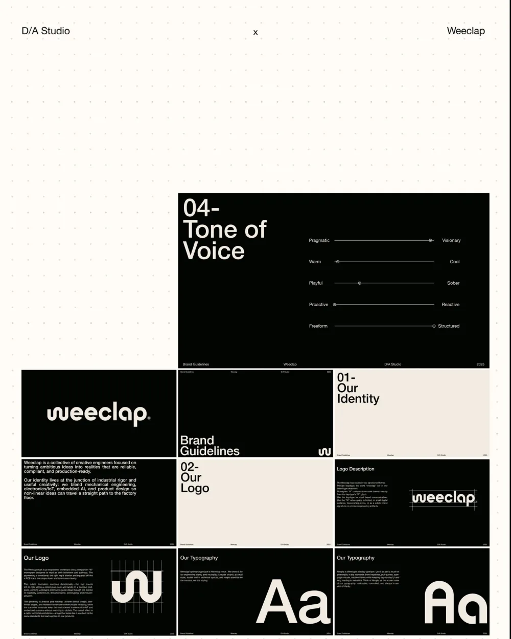
Weeclap is a collective of creative engineers focused on turning ambitious ideas into realities that are reliable, compliant and production-ready.
Its identity lives at the junction of industrial rigour and useful creativity: mechanical engineering, electronics and IoT, embedded AI and product design, so that non-linear ideas can travel a straight path to the factory floor.
Tone of voice
- PragmaticVisionary
- WarmCool
- PlayfulSober
- ProactiveReactive
- FreeformStructured
Identity
An engineered wordmark and a W monogram that reads as a letter and as a pathway.
- On black
- On mint
- On paper
The asymmetry is intentional: the right leg of the W is shorter and squared off, like a circuit trace that steps down and ends cleanly.
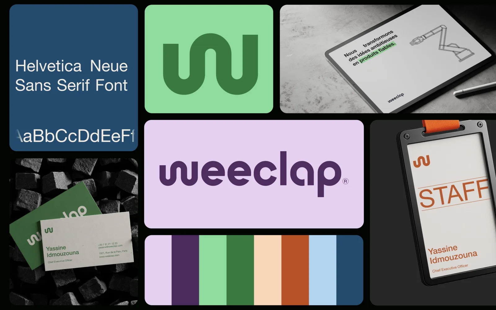
- Primary Lilac #E4CFF0RGB 228 207 240
- Logo Plum #4B2B5DRGB 75 43 93
- Accent Mint #8FDB9DRGB 143 219 157
- Accent Forest #3A7940RGB 58 121 64
- Support Peach #F8D5B9RGB 248 213 185
- Support Rust #B75228RGB 183 82 40
- Support Sky #B2D4EFRGB 178 212 239
- Support Navy #244A6ERGB 36 74 110
Light · Roman · Medium · Bold
Engineering clarity: it reads cleanly at small sizes and keeps attention on the content.
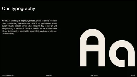
Hero headlines, quotes, campaigns
The accent colour of the typography: noticeable, controlled, always in service of clarity.
Illustration
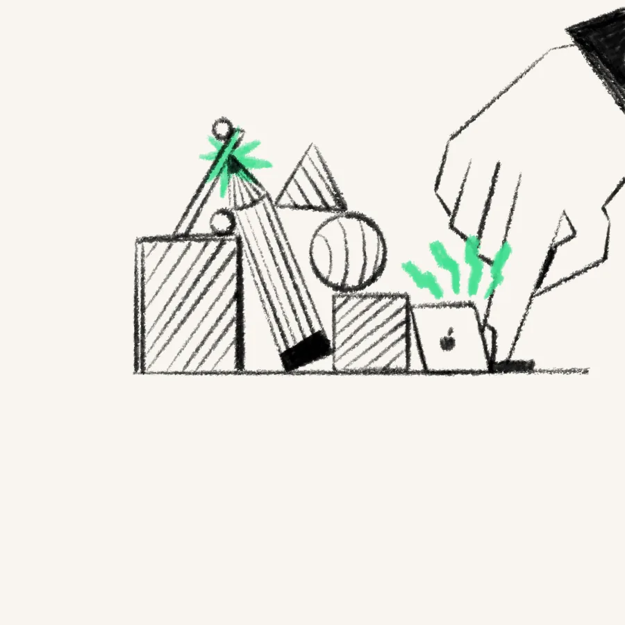
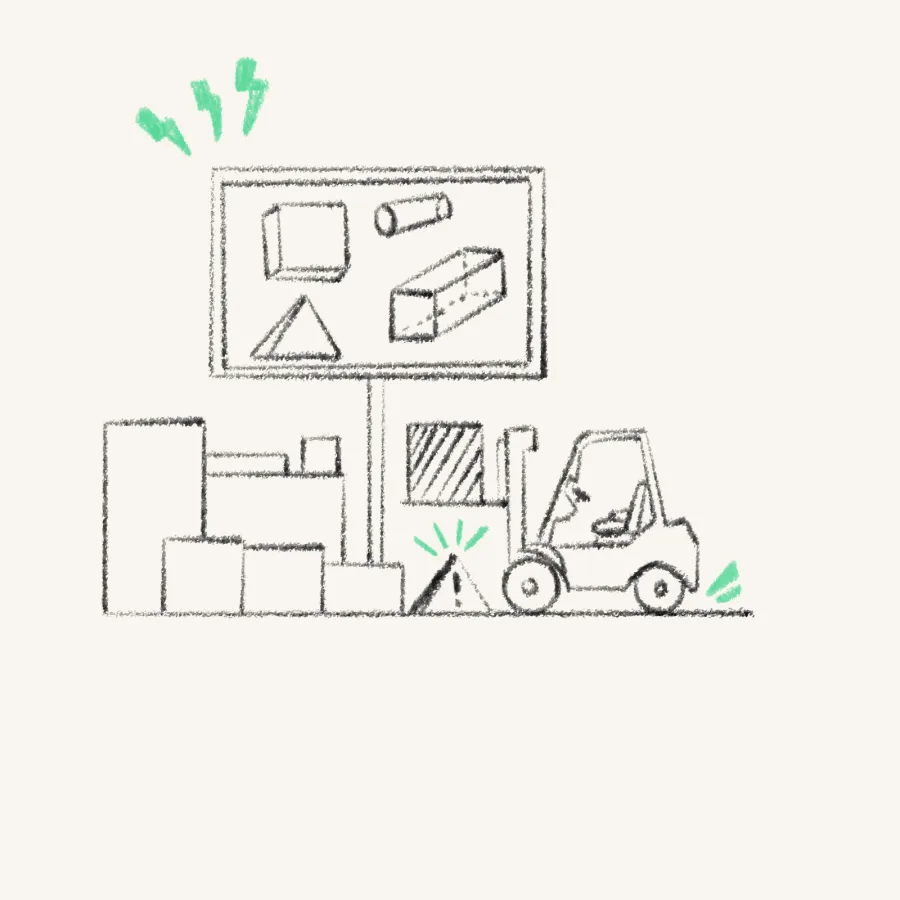
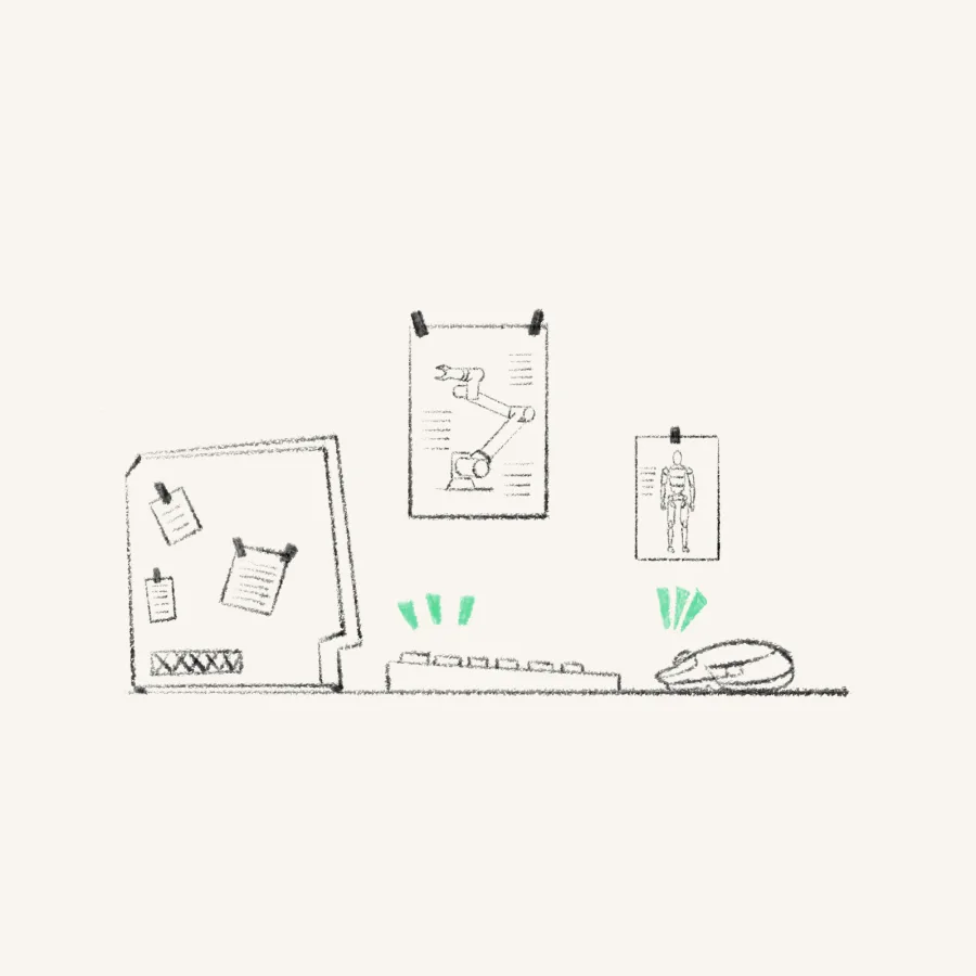
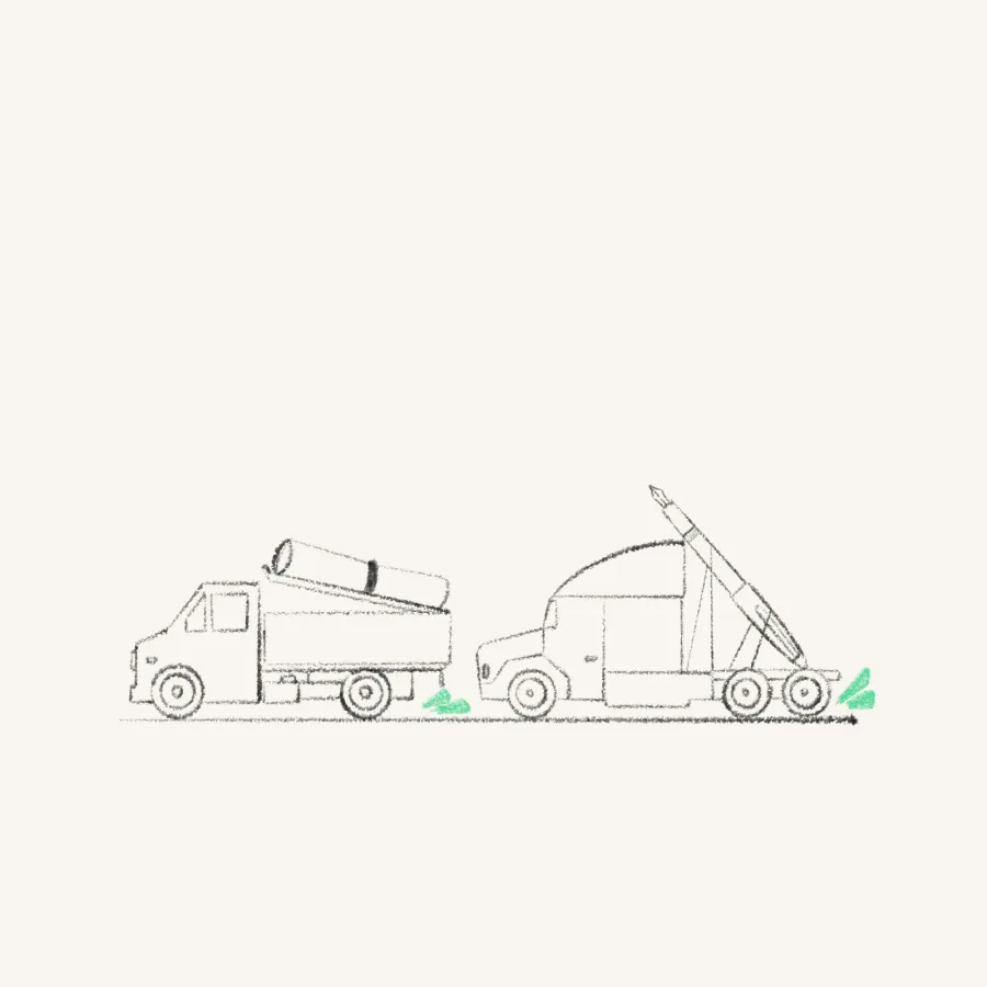
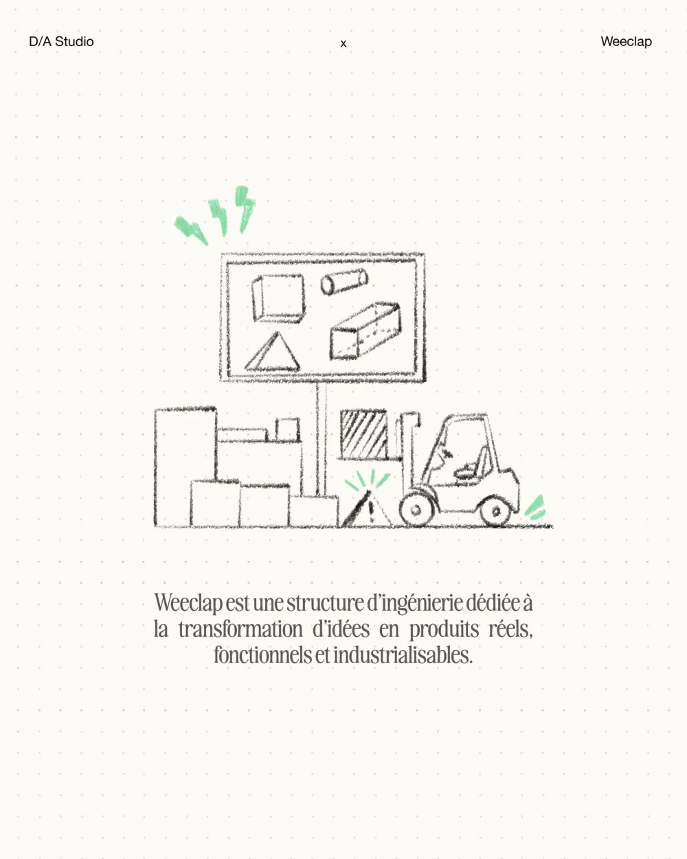
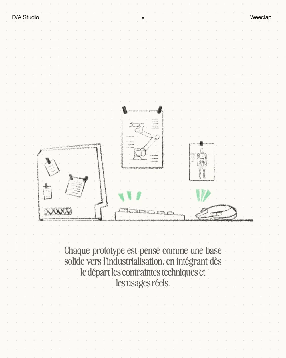
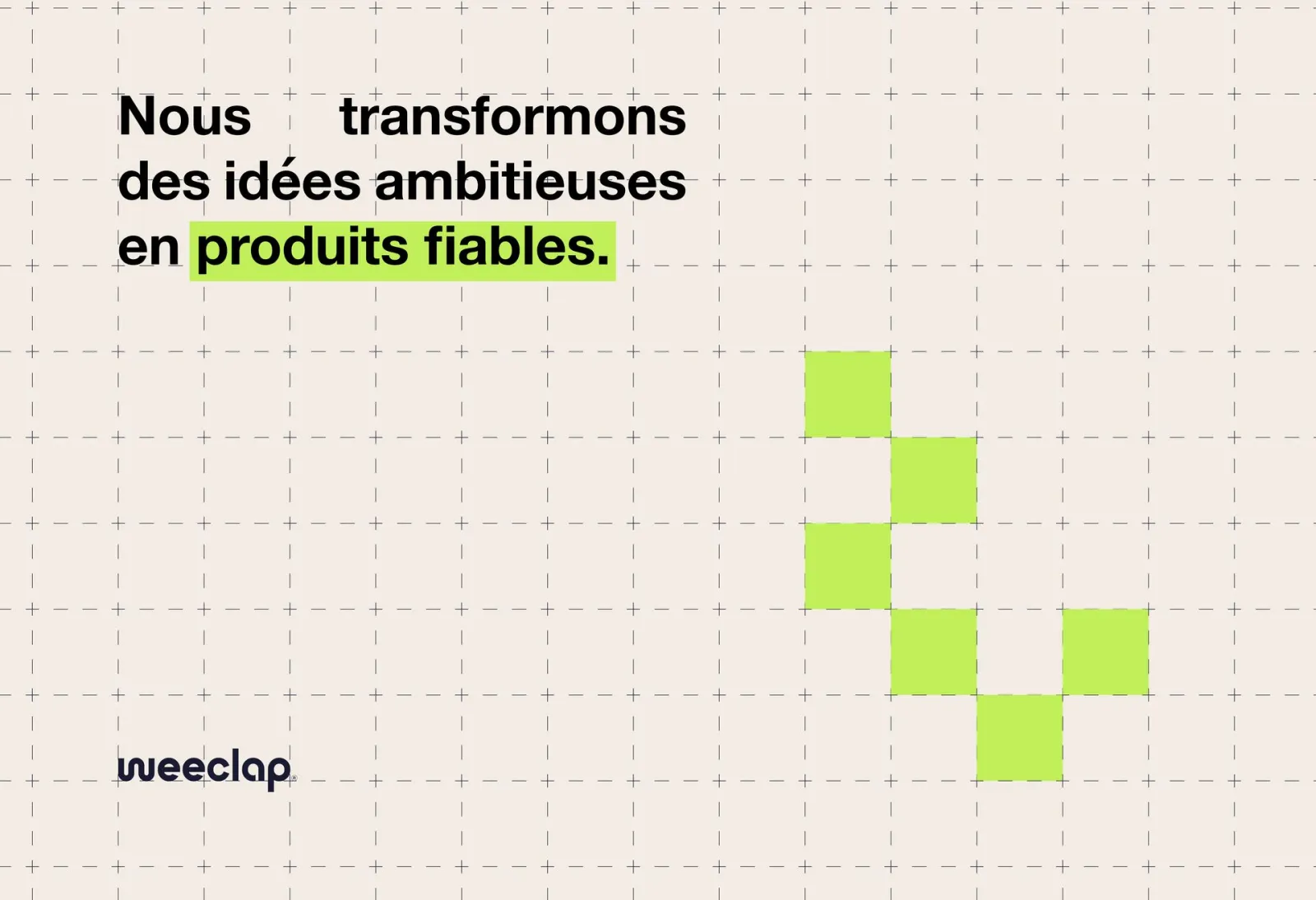
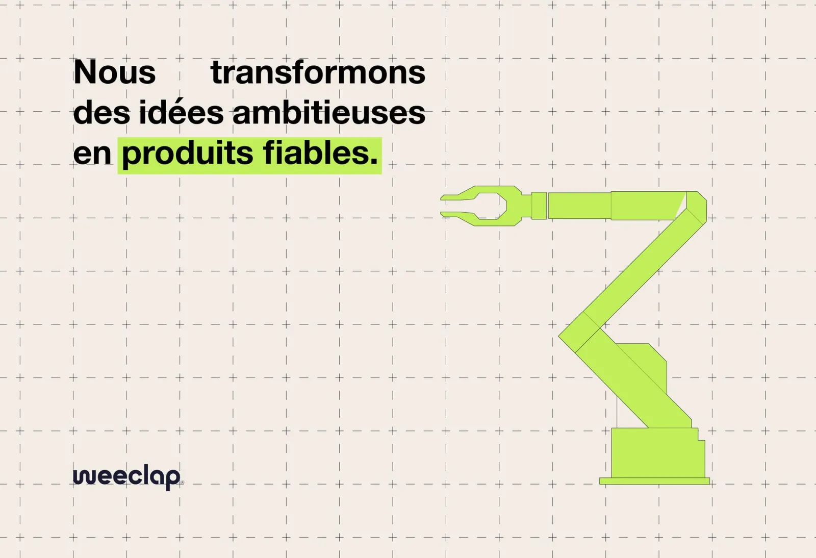
Pencil sketches with a touch of green: the drawings of an engineer’s notebook, from first idea to production line.
In the world
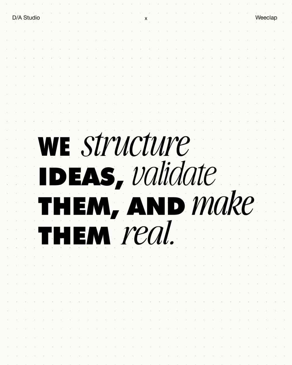
Structure, validate, make real: the identity follows an idea all the way to the product.
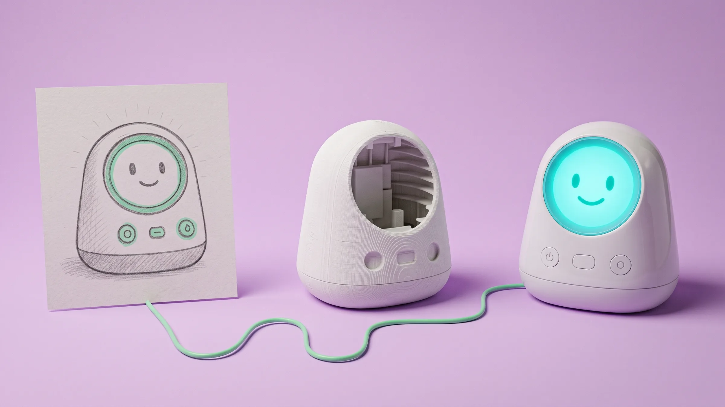
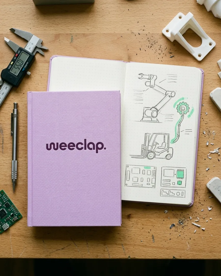
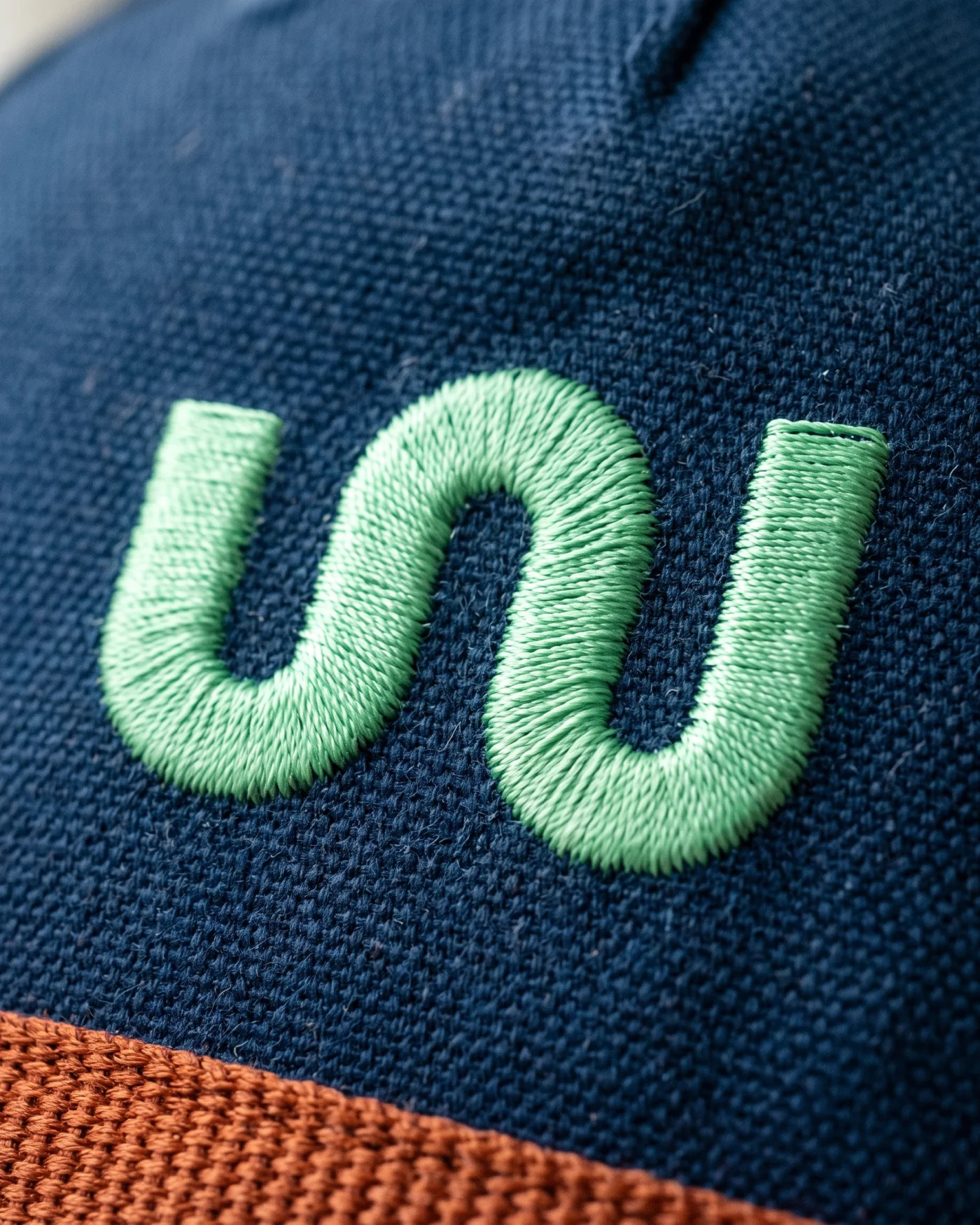
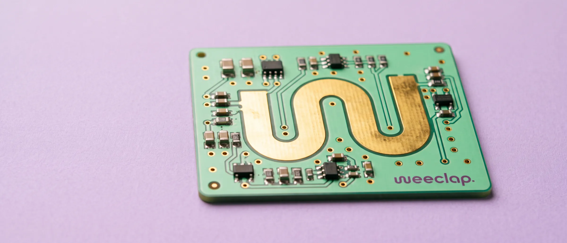
We structure ideas, validate them, and make them real.
Brand strategy, identity and art direction by D/A Studio.
Want a brand like this?
Tell us where you are and where you want to be. You’ll hear back from one of us, not a form robot, within a day.
