
Turāb
A brand identity for a ceramics house, built around a single word: earth.
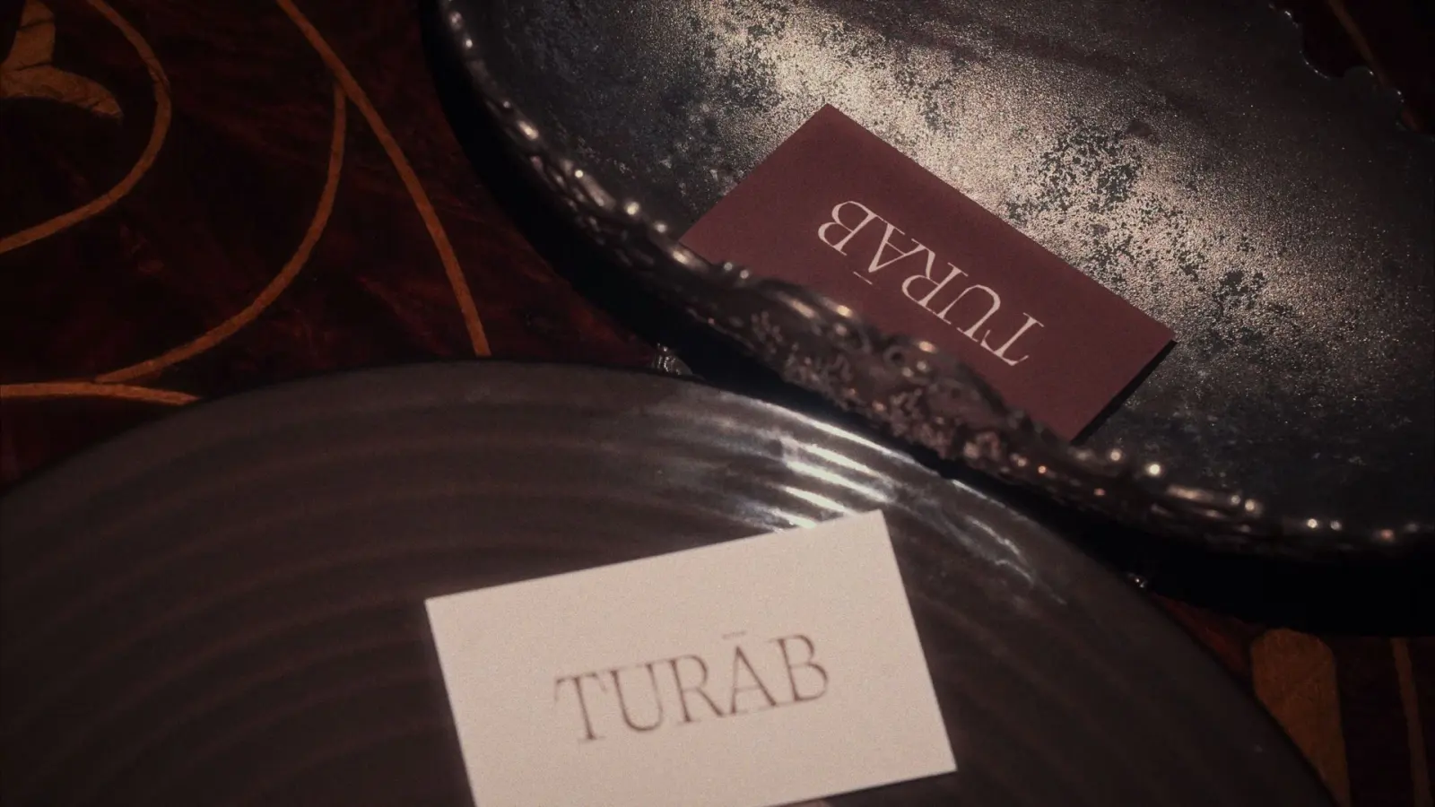
- Client
- Turāb
- Sector
- Handmade ceramics
- Scope
- Brand strategyBrand storyWordmarkIllustrationPrintPackaging
The idea
Formed by hand.
Shaped by earth.
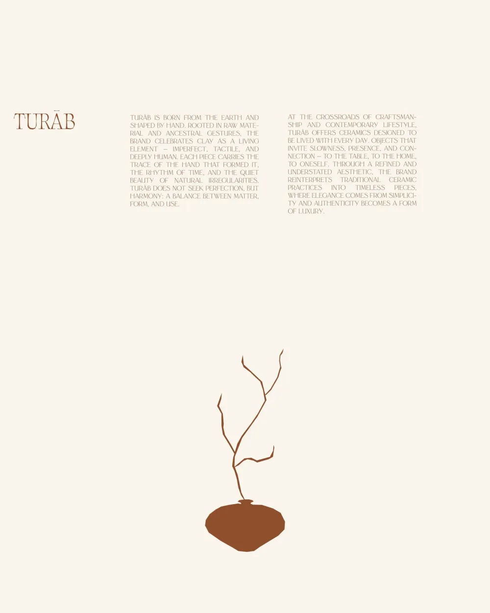
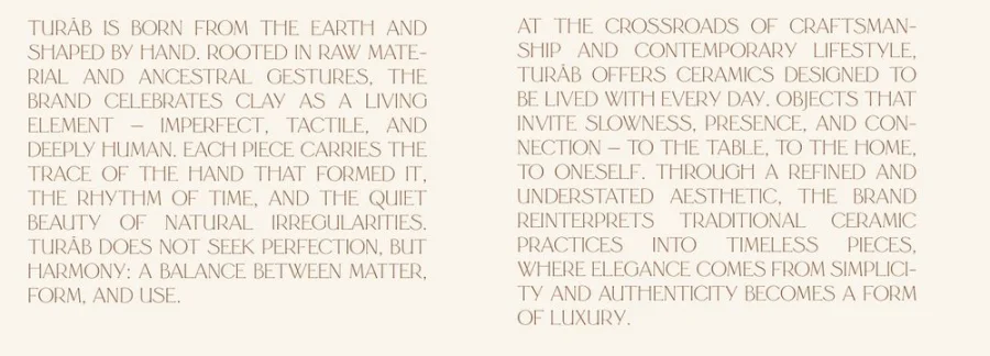
Turāb is born from the earth and shaped by hand. Rooted in raw material and ancestral gestures, the brand celebrates clay as a living element: imperfect, tactile and deeply human. Each piece carries the trace of the hand that formed it.
At the crossroads of craft and contemporary living, Turāb makes ceramics to be lived with every day: objects that invite slowness, presence and connection, to the table, to the home, to oneself.
تراب
turābArabic, noun
Earth. Soil. Origin.
The name speaks of origin, material and grounding, and of the close bond between the hand, the clay and time. The whole brand fits in this one word.
- Hand
- Clay
- Time
The three things every piece is made of, and the idea behind the identity.
Identity
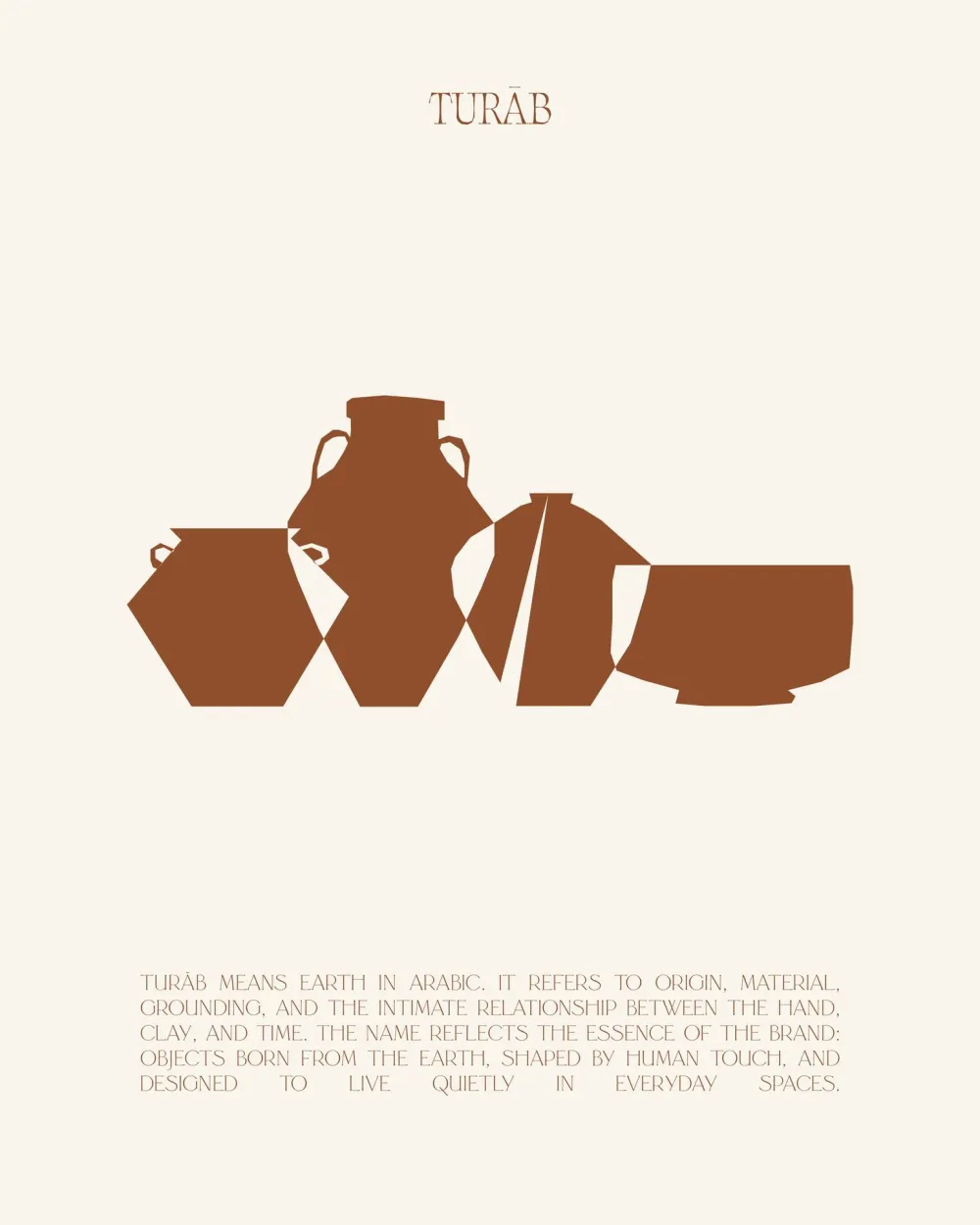
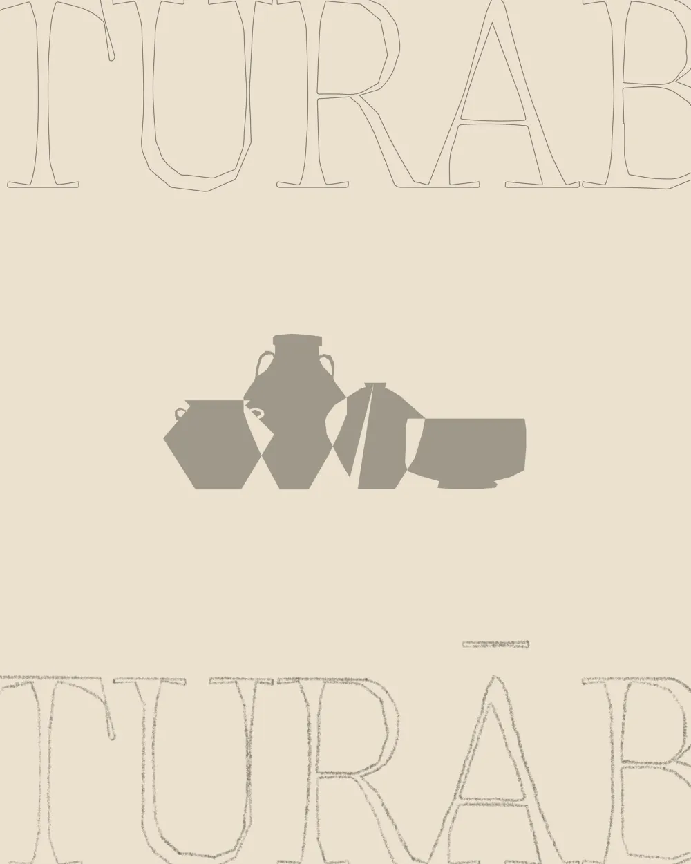
A quiet wordmark, a family of vessel silhouettes and colours taken from the clay itself.
- On terracotta
- On wine
- On sand
Fine, high-contrast capitals. The macron of the long Ā keeps the Arabic pronunciation.
- Primary Terracotta #8E4E2BRGB 142 78 43
- Paper Ivory #F7F2E8RGB 247 242 232
- Accent Wine #5A2D2BRGB 90 45 43
- Support Sand #E6D6C3RGB 230 214 195
- Shadow Kiln #1C1412RGB 28 20 18
Drawn for Turāb
Light · Capitals only
Art direction
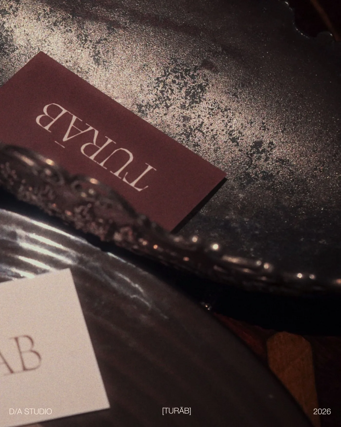
Low light, deep shadows, real textures: every image is shot like a still life, close to the material.
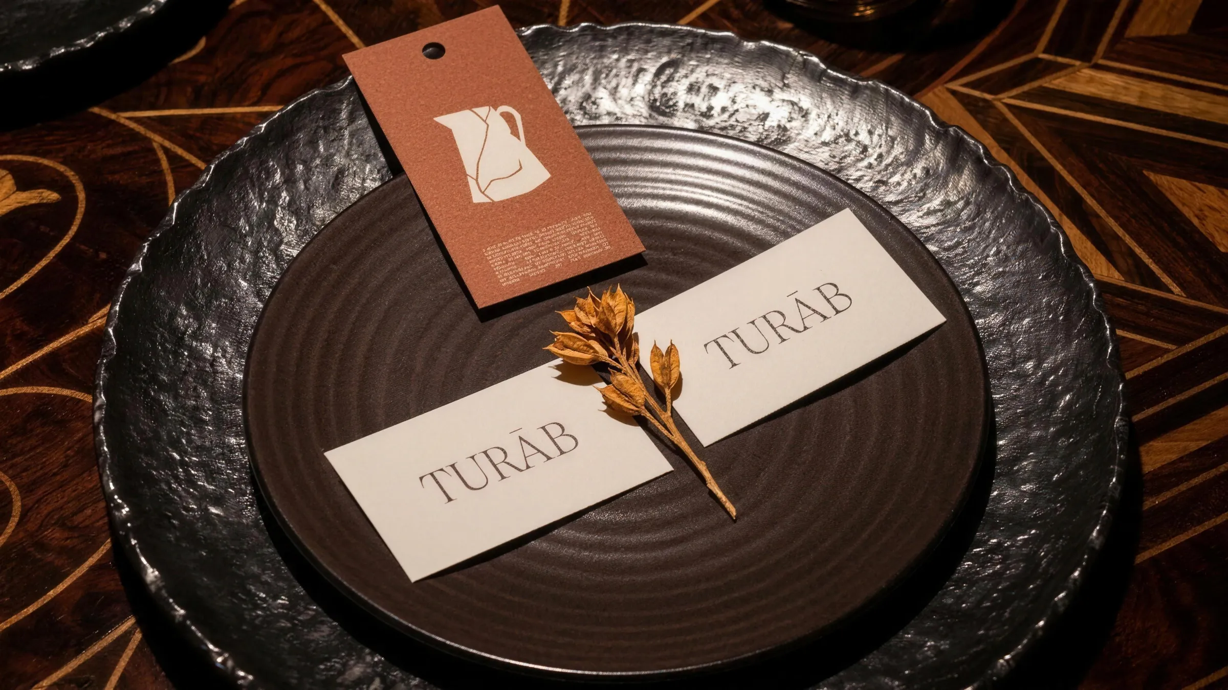
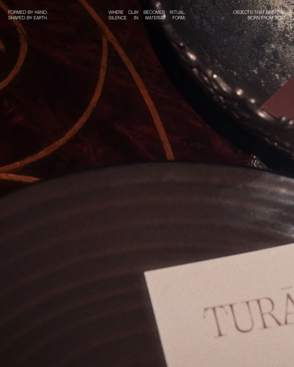
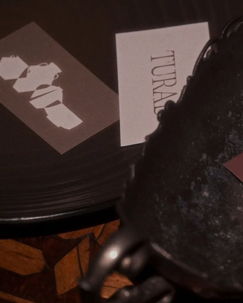
Where clay becomes ritual. Silence in material form.

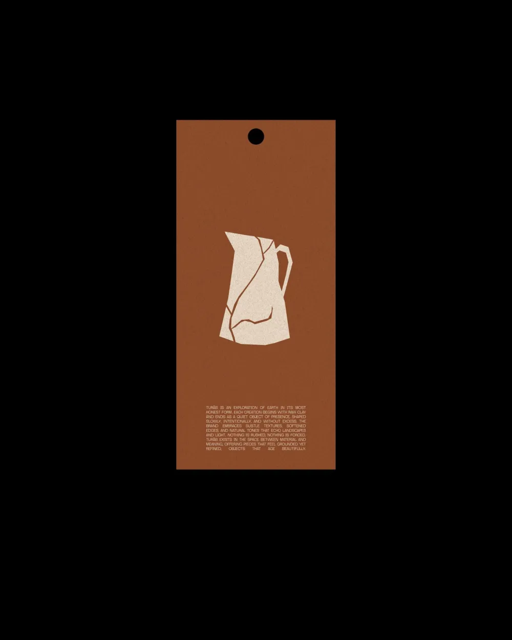
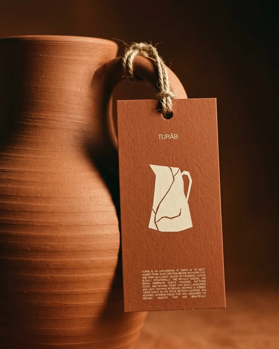
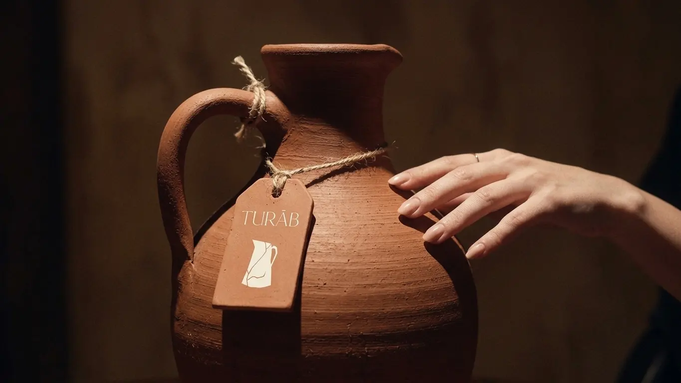
A hang tag that tells the story: the cracked jug, tied to every piece.
Packaging
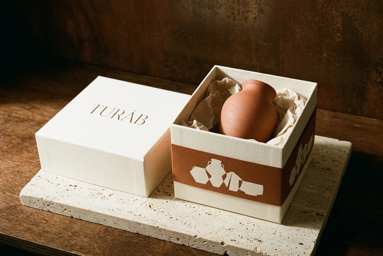
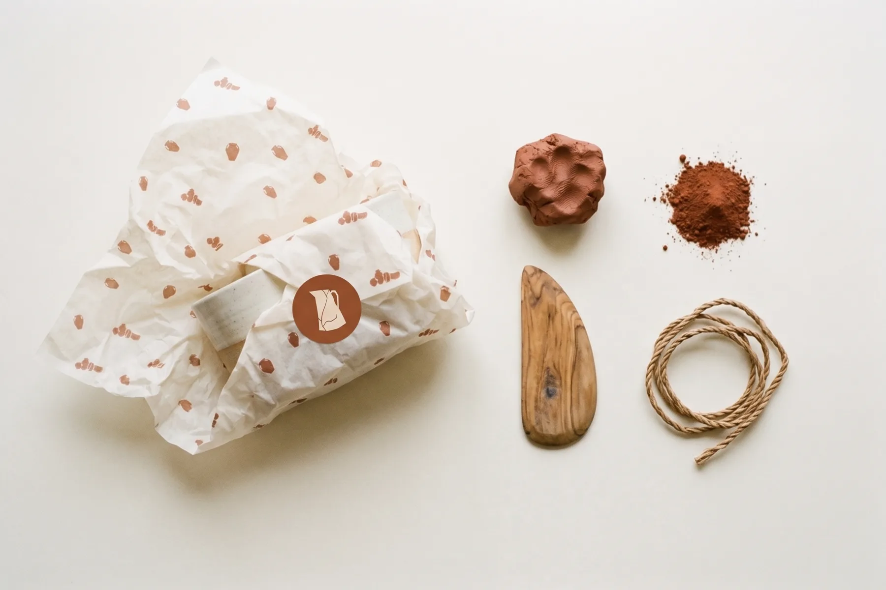
Unboxing is part of the ritual: ivory boxes, terracotta bands, tissue printed with the vessels and the cracked jug as a seal.
Every day
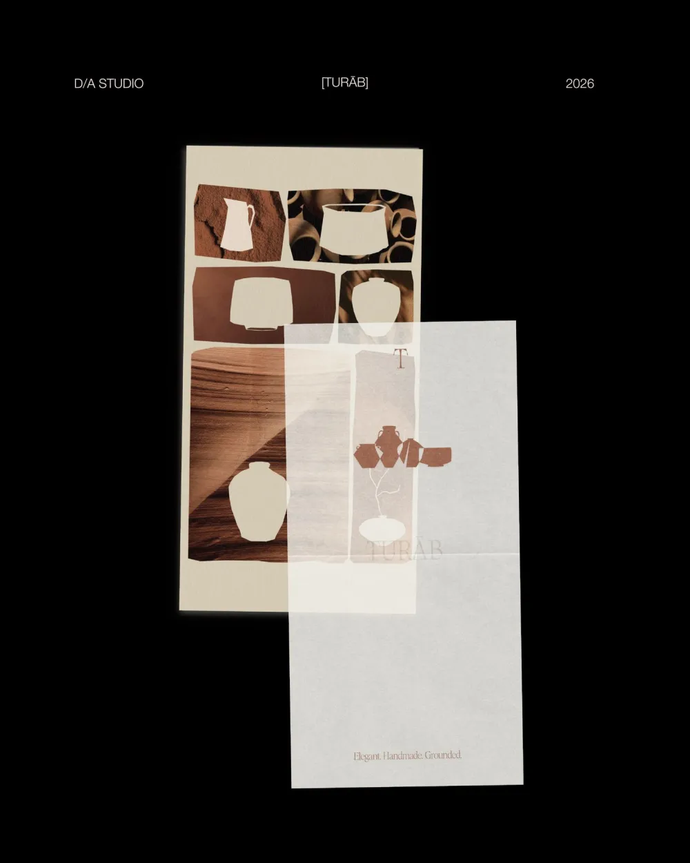
Made to be held, used and shared: from the hand to the phone screen, the same calm voice.
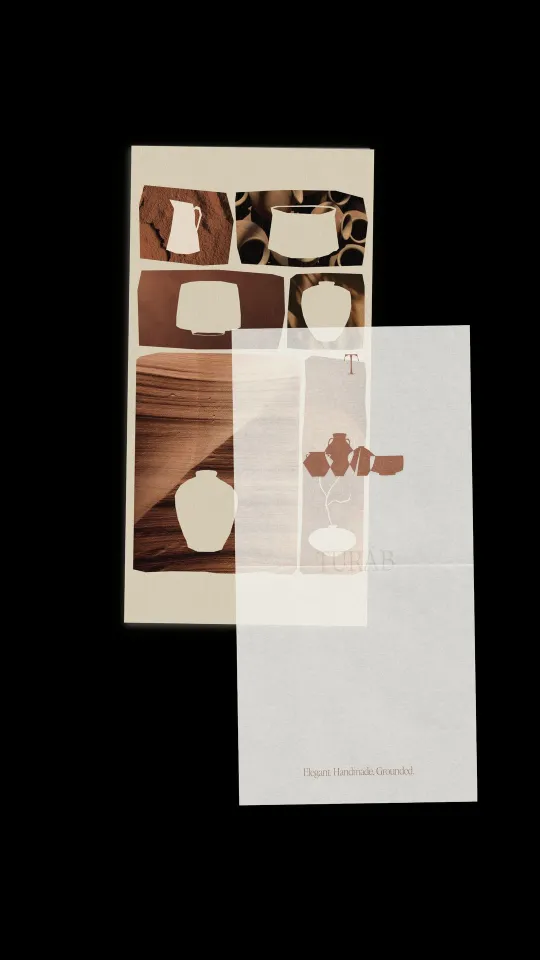
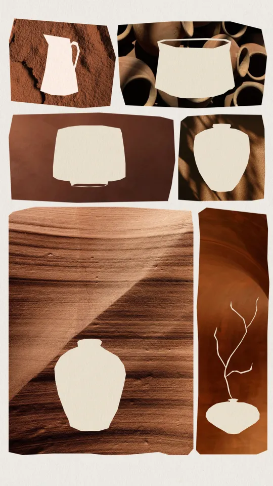
Instagram stories
Elegant. Handmade. Grounded.
Brand strategy, identity and art direction by D/A Studio.
Want a brand like this?
Tell us where you are and where you want to be. You’ll hear back from one of us, not a form robot, within a day.
