
Branding portfolio
Yoolish
A new way to learn English, on your own terms.
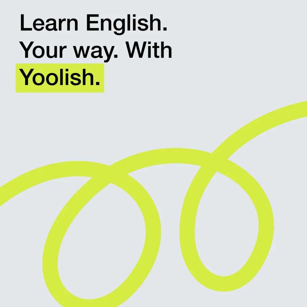
- Client
- Yoolish
- Sector
- English learning app
- Scope
- Brand identityWordmarkCampaignSocial media
01
The idea
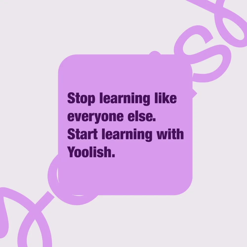
Stop learning like everyone else.
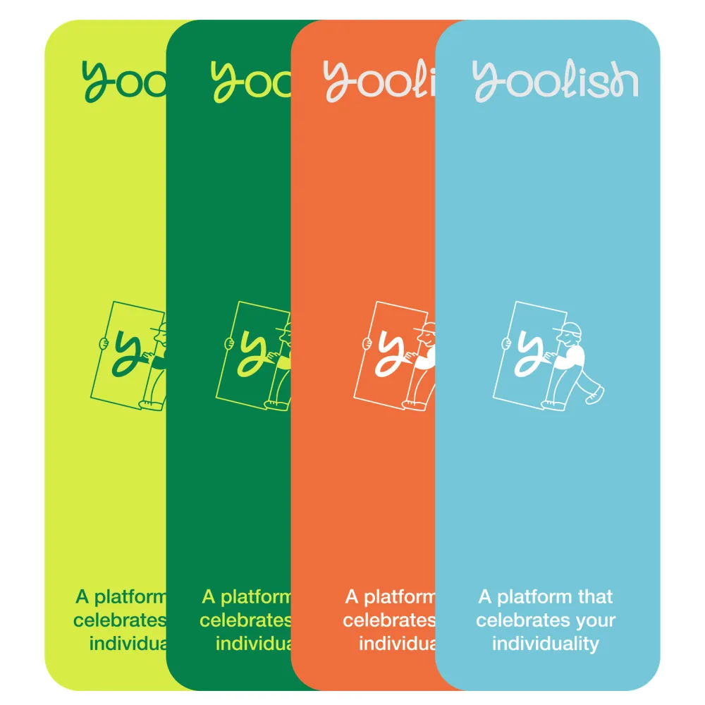
Yoolish is a platform that celebrates each learner’s individuality: the journey to English fluency starts here, on your own terms.
The name joins “you” and “English”. The identity had to feel like a good conversation: friendly, a bit playful, and always moving forward.
02
Identity
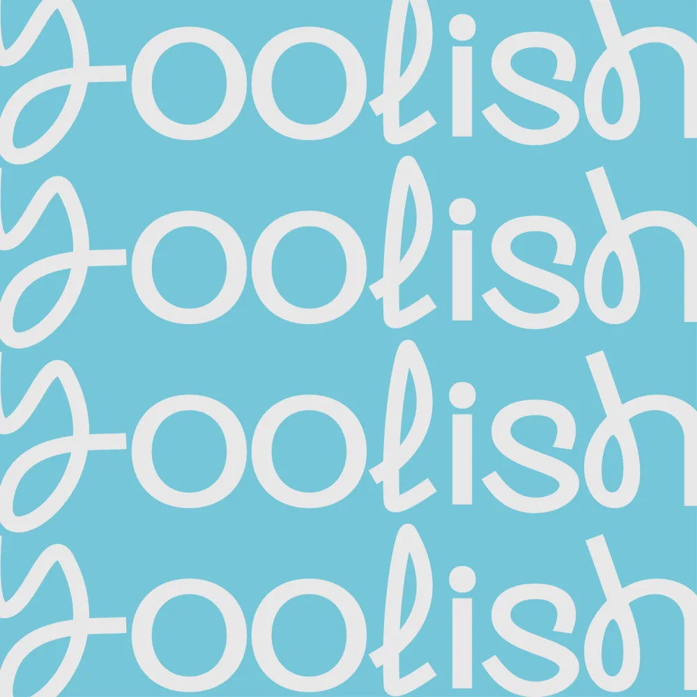
A connected script with a looping y and seven colours that speak up.
Wordmark
- On green
- On plum
- On sky
One line, written without lifting the pen.

- Primary Violet #793AD2RGB 121 58 210
- Primary Lime #E2F165RGB 226 241 101
- Text Plum #3E1456RGB 62 20 86
- Accent Green #398050RGB 57 128 80
- Accent Orange #E47649RGB 228 118 73
- Accent Sky #75C6D9RGB 117 198 217
- Paper Lilac #F2ECF4RGB 242 236 244
Wordmark
Custom script

Drawn for Yoolish
Headlines
Extended grotesque
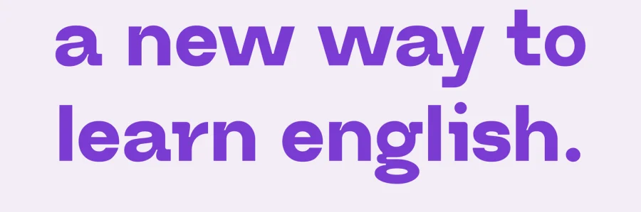
Bold, lowercase
Statements
Condensed grotesque
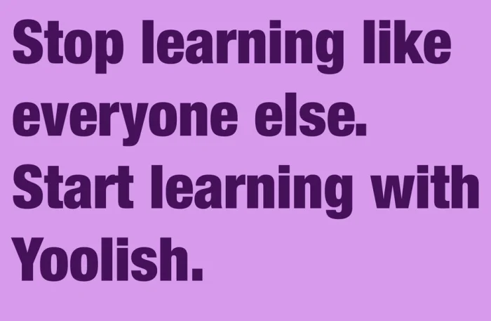
Bold
03
Campaign
In the street and in the café, where people actually practise their English.
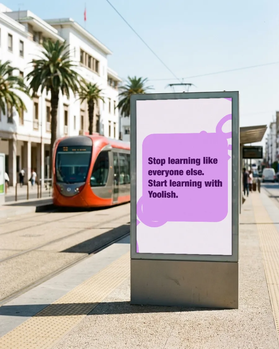
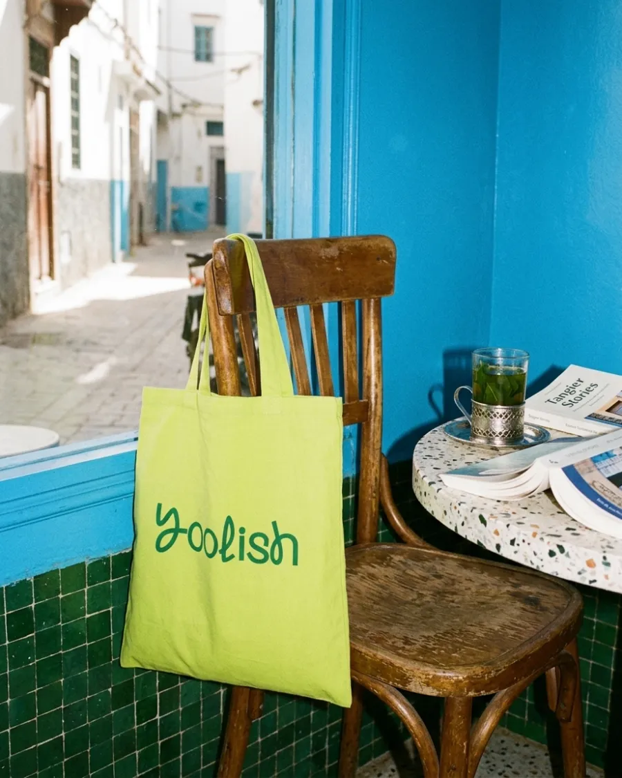
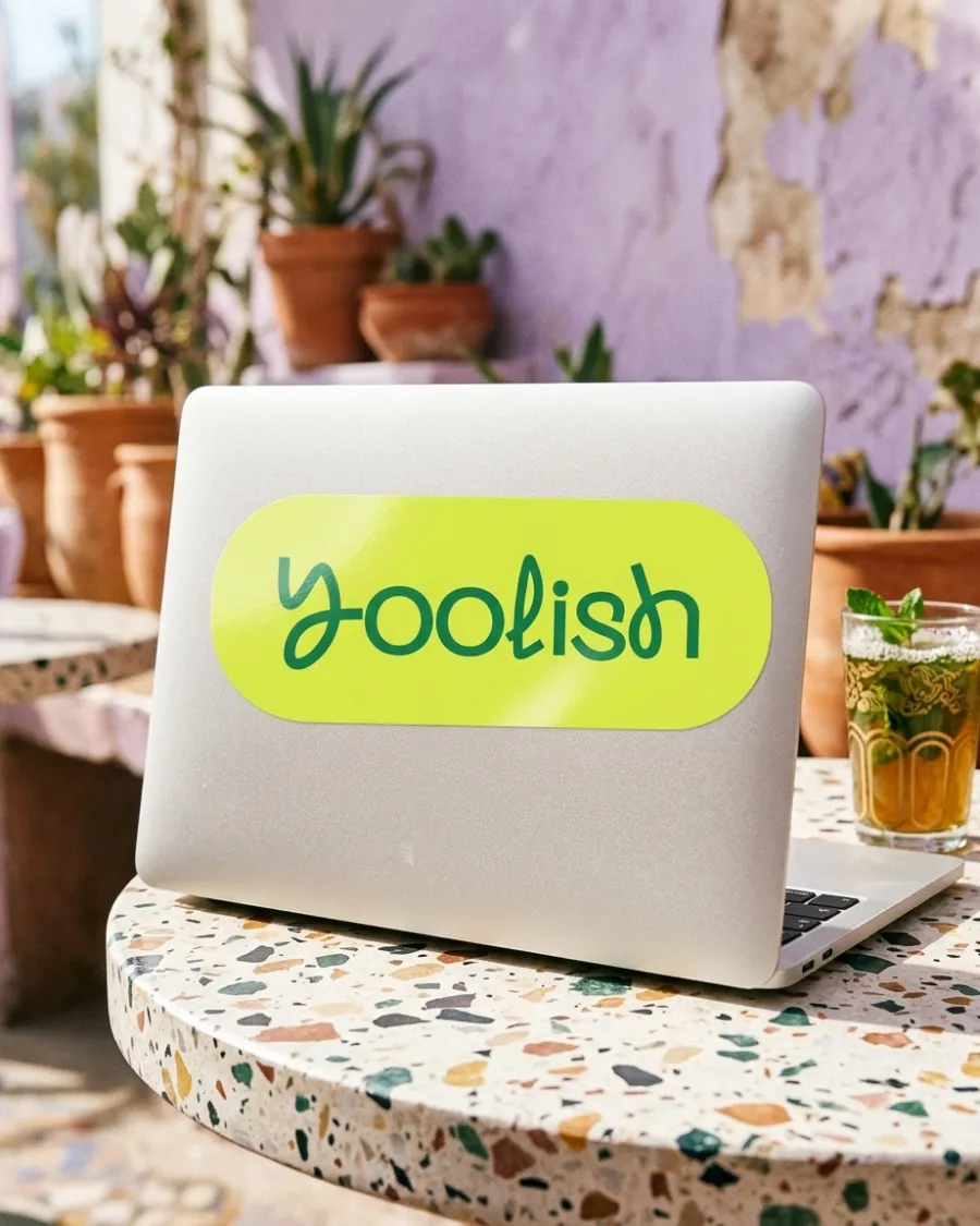
Learn English. Your way.
Brand strategy, identity and art direction by D/A Studio.
Want a brand like this?
Tell us where you are and where you want to be. You’ll hear back from one of us, not a form robot, within a day.
