
Lbrotherie
Embroidery passed down from a grandmother to her grandchildren, with an identity drawn stitch by stitch.
- Client
- Lbrotherie
- Sector
- Custom embroidery
- Scope
- Brand identityLogotype & emblemBrand storyLabelsPackagingSocial media
The idea
From grandmother to grandchildren.
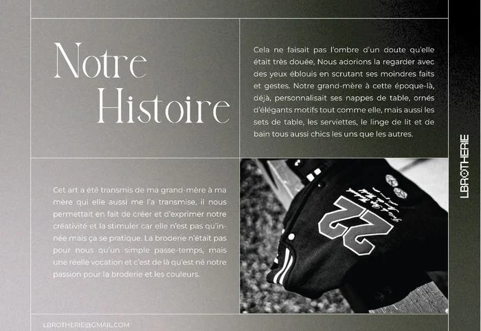
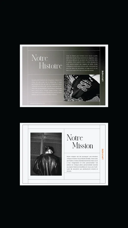
Their grandmother already embroidered her tablecloths, napkins and bed linen with elegant motifs. The art passed from her to her daughter, then to her grandchildren: not just a pastime, a real vocation.
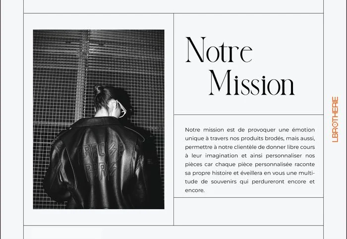
Lbrotherie’s mission is to create a unique emotion through embroidered pieces, and to let every customer personalise theirs, because each piece tells its own story.
Identity
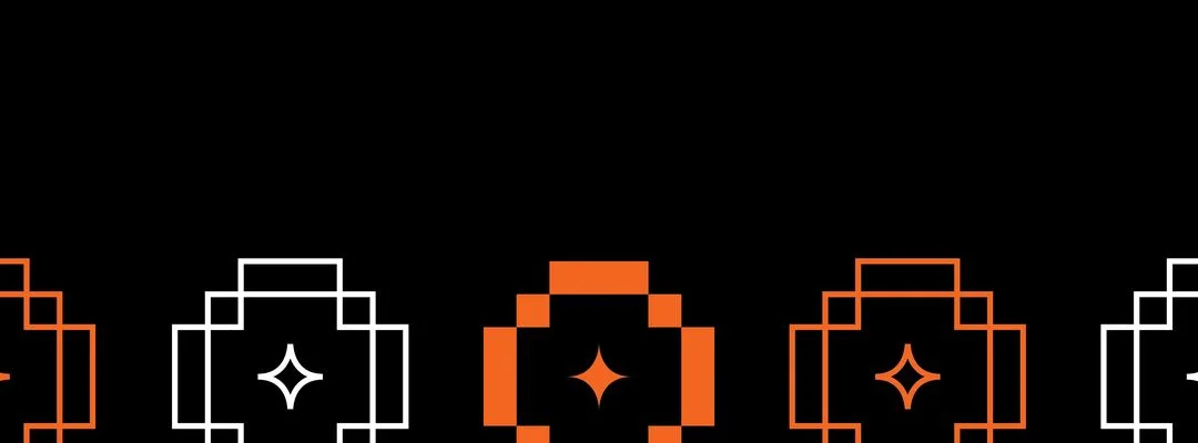
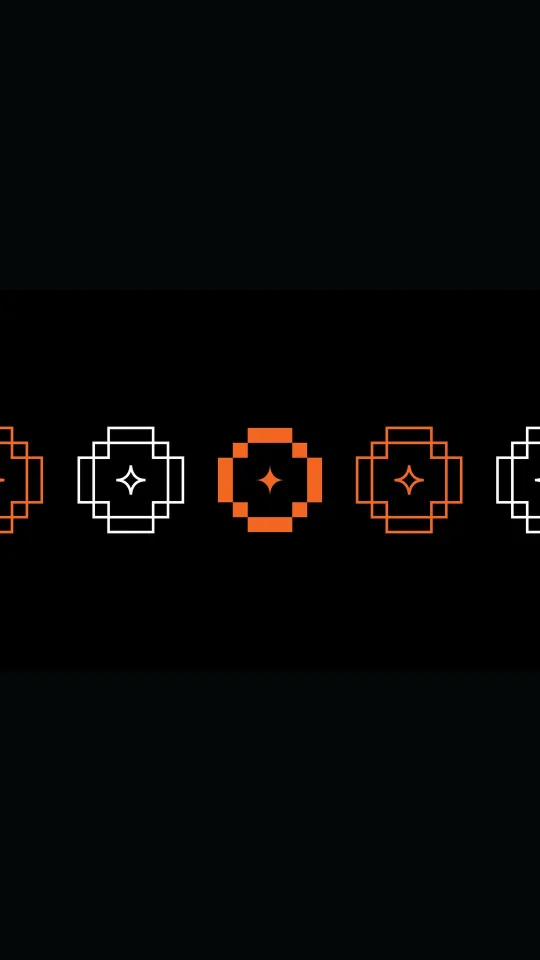
The O of the name is drawn stitch by stitch, like a cross-stitch pattern, around a needle’s spark.
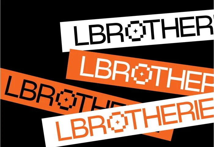
- On white
- On orange
- Orange on black
Wide geometric capitals; the emblem takes the place of the O.
- Primary Black #0B0B0BRGB 11 11 11
- Primary White #FFFFFFRGB 255 255 255
- Signal Thread orange #F36522RGB 243 101 34

Drawn for Lbrotherie
Medium
Vos habits de fil en aiguille !
Light
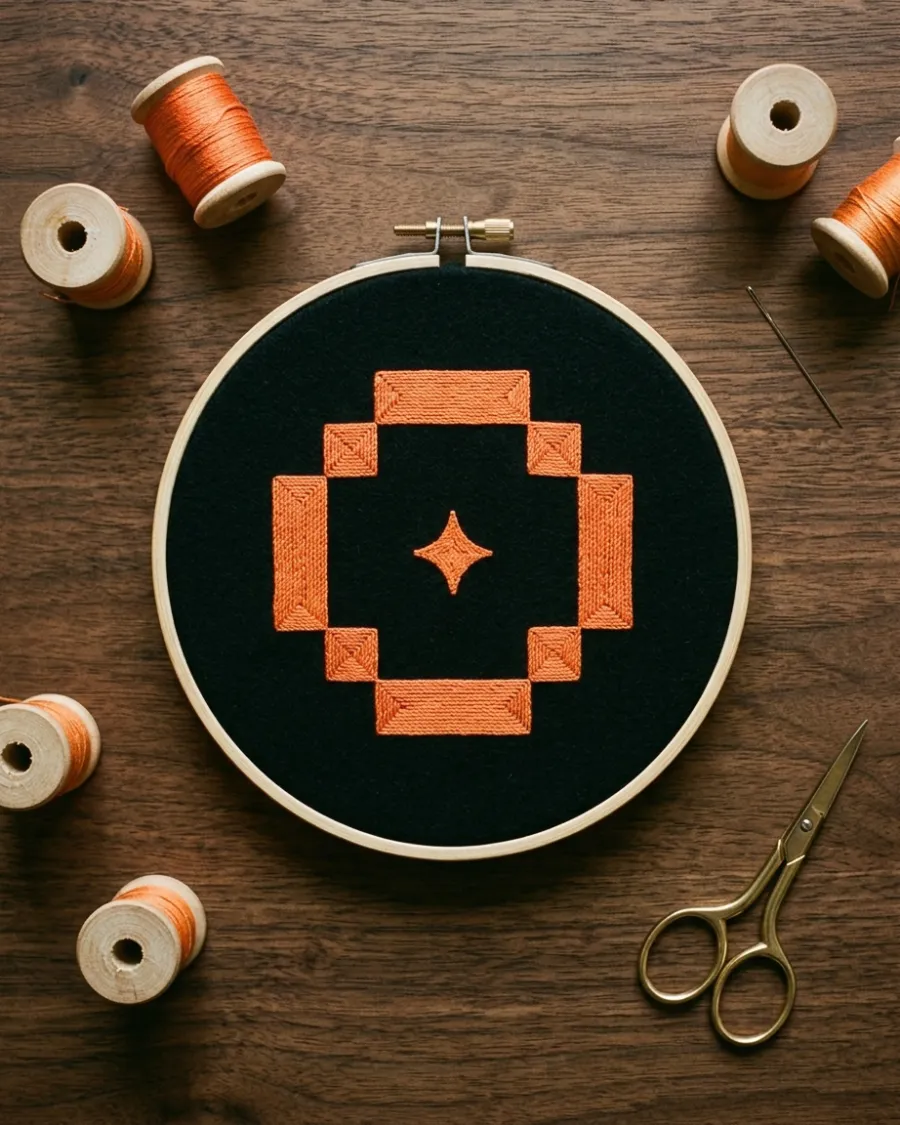
Embroidery
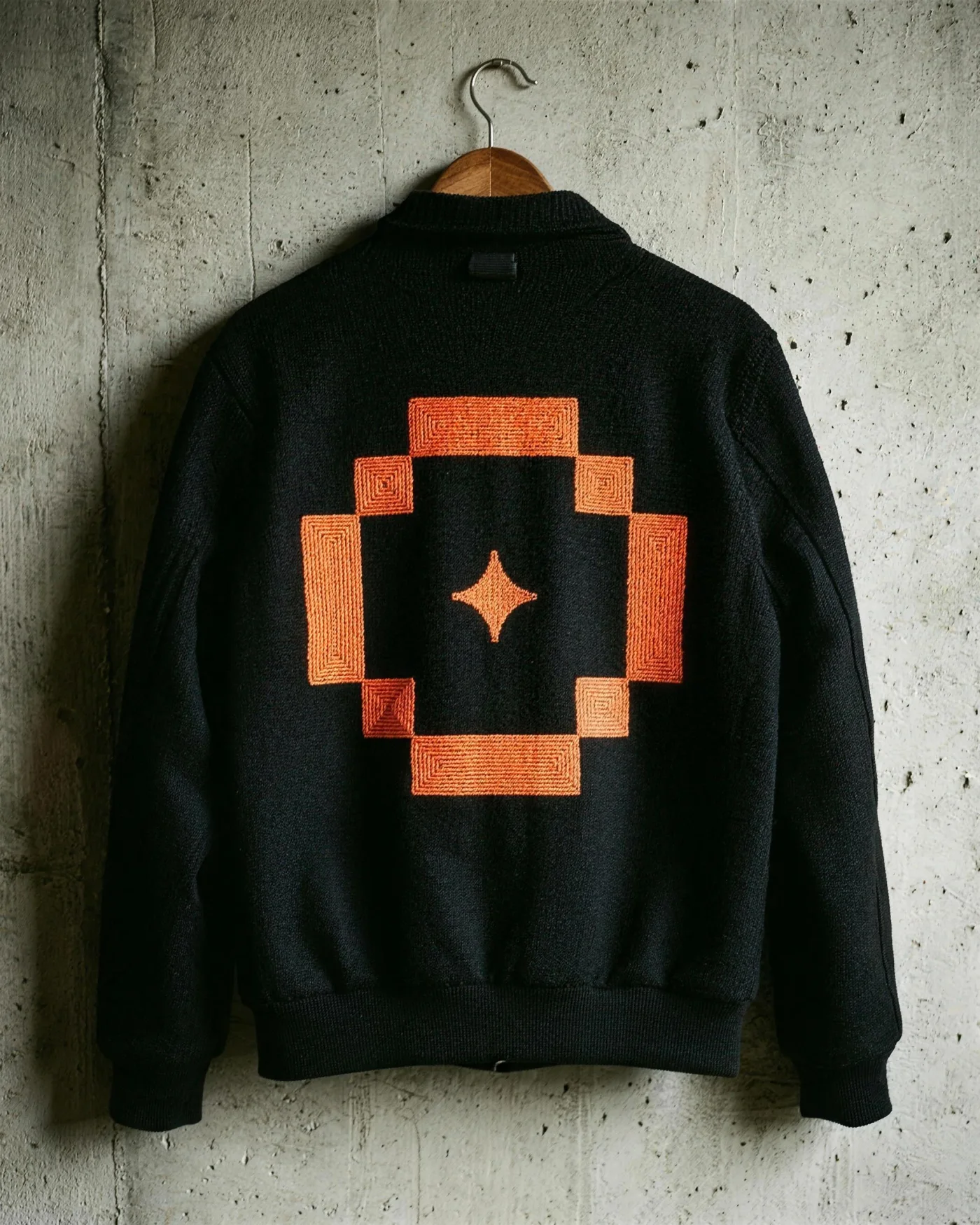
The emblem is made to be stitched: its blocks follow the grid of the needle.
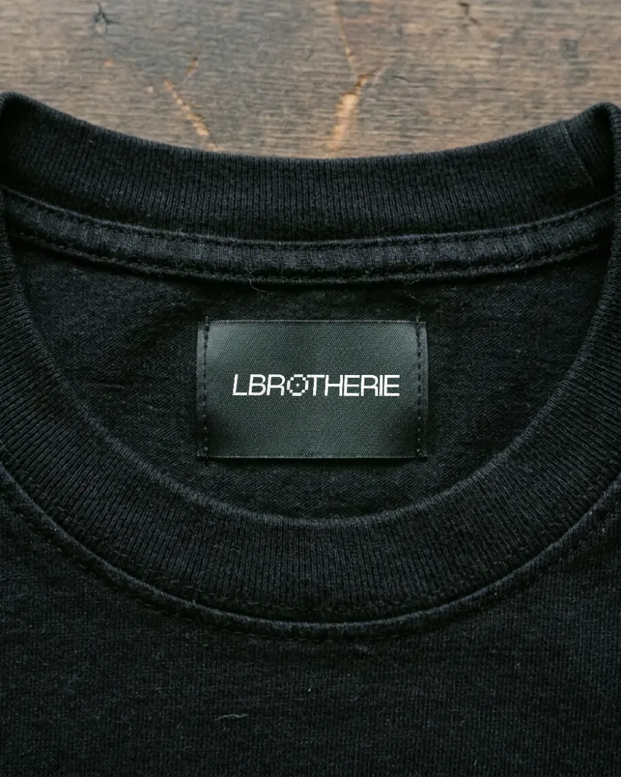
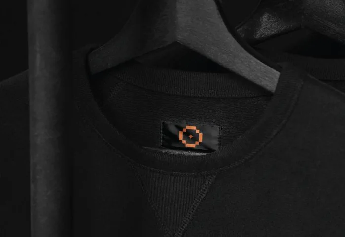
In the world
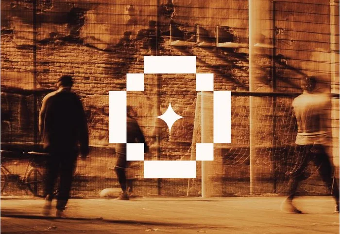
On the street and on Instagram: black, white and one thread of orange.
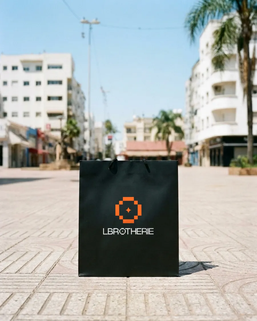
Seen from across the street.
The orange emblem above the white logotype, printed on matte black paper.
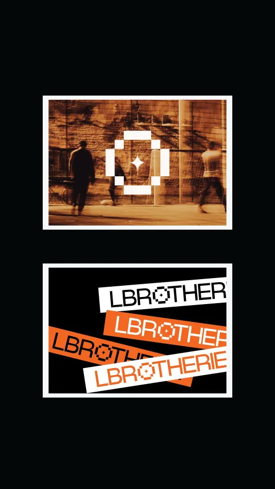
Instagram stories
Your clothes, stitch by stitch.
Brand strategy, identity and art direction by D/A Studio.
Want a brand like this?
Tell us where you are and where you want to be. You’ll hear back from one of us, not a form robot, within a day.
